 Call Us — +1 (929) 201-3767
 info@childrenpublishers.com

10 Children’s Book Cover Ideas: From DIY to Professional Design
A children’s book cover has about three seconds to do its job. That’s roughly how long a parent scrolls past it online, or a kid’s eyes land on it before moving to the next spine on the shelf. In that window, the cover has to tell them who the book is for, what mood it’s setting, and whether it’s worth picking up. Miss that window, and the story inside never gets a chance.
This is why cover design deserves more thought than most authors give it. Getting the details right- the character, the color, the type- is what separates a cover that gets picked up from one that gets scrolled past. That’s exactly what solid children’s book cover design ideas are meant to solve.
Some Crazy Children’s Book Cover Ideas To Inspire You
Cover Idea #1
Age First: Know Your Reader
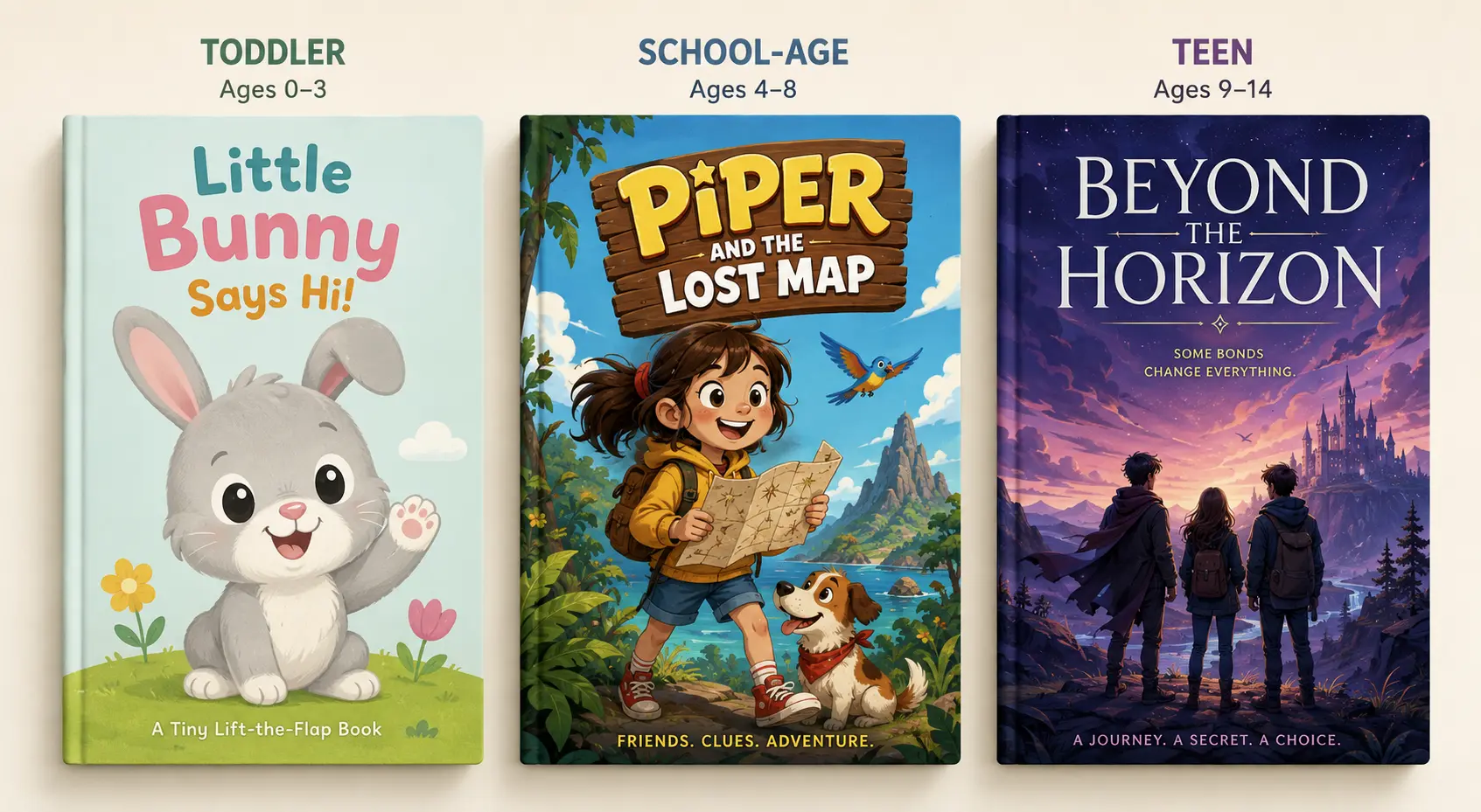
Before picking colors or characters, decide who’s actually going to hold the book. A toddler, a second grader, and a teenager respond to completely different visual cues, and a cover built for the wrong age group loses both the kid and the parent buying it.
For Toddlers
Keep it simple. One familiar animal or object, soft rounded shapes, and calm colors work better than a busy scene. Nothing abstract, nothing too detailed for a young eye to process quickly.
For School Kids
This age group picks books on their own, so the cover needs a hook. Slightly more detail, a cartoon-style character with personality, and a clear sense of what the story’s about.
For Teens
Bolder color, current styling, and typography that signals genre fast. Think fantasy, friendship, or coming-of-age cues they already recognize from books they’ve read before.
Cover Idea #2
Familiar Faces: A Friendly Hook
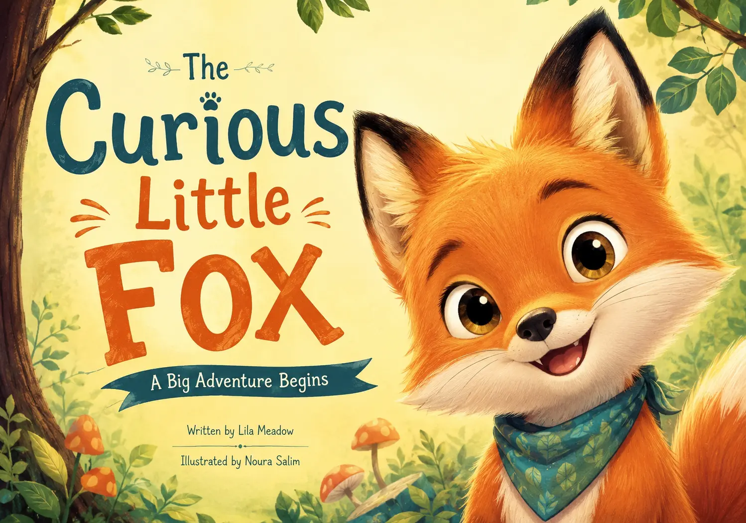
Kids connect with what they already know. A smiling animal, an expressive character, or a face that shows clear emotion pulls a young reader in faster than an abstract pattern or a real photograph ever could. Most strong children’s book cover ideas start with a character the reader can read at a glance, happy, curious, or a little mischievous.
Skip Stock Photos
Real-life images rarely work here. They read as too formal or too adult, and they don’t match the tone kids expect from a storybook.
Let Emotion Lead
The character’s expression matters more than the detail around it. A wide grin or a curious tilt of the head does more work than an elaborate background ever will.
Cover Idea #3
Color Set the Mood First
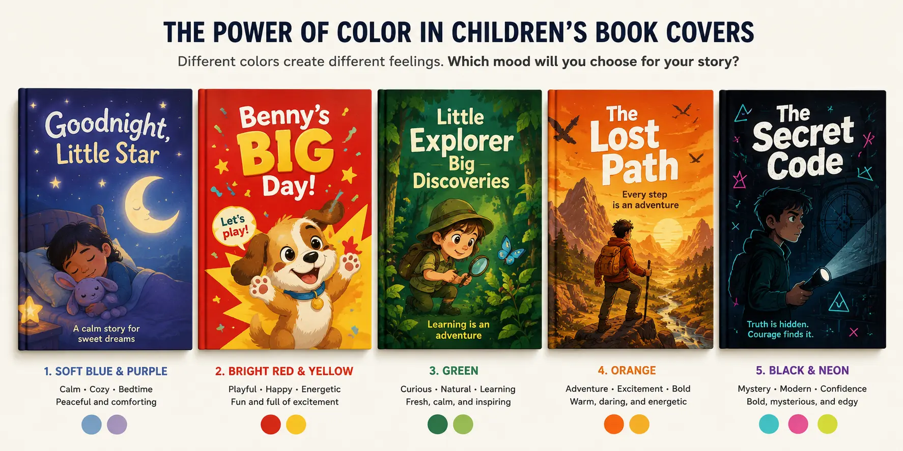
Color is the first thing a reader notices, even before the character or the title. It sets the mood before anyone reads a single word, which makes it one of the most important choices on the entire cover.
Warm vs Cool Tones
Soft purples and deep blues signal a calm, bedtime story. Bright primary colors work best for toddler books since they catch developing eyes fast. Bold, high-contrast combinations suit older kids and pre-teens who respond to energy and confidence on a cover.
Color, Mood, and Fit
| Color | Mood It Sets | Best Fit |
| Soft blue or purple | Calm, cozy | Bedtime stories |
| Bright red or yellow | Playful, energetic | Toddler books |
| Green | Focused, curious | Nature or learning themes |
| Orange | Exciting, upbeat | Adventure stories |
| Bold contrast (black/neon) | Confident, current | Pre-teen and teen books |
Picking a color with intention, not just because it looks nice, gives the cover a mood that matches the story before the reader even opens the book.
Cover Idea #4
Bold Type: Built to Be Seen Small
Readable First
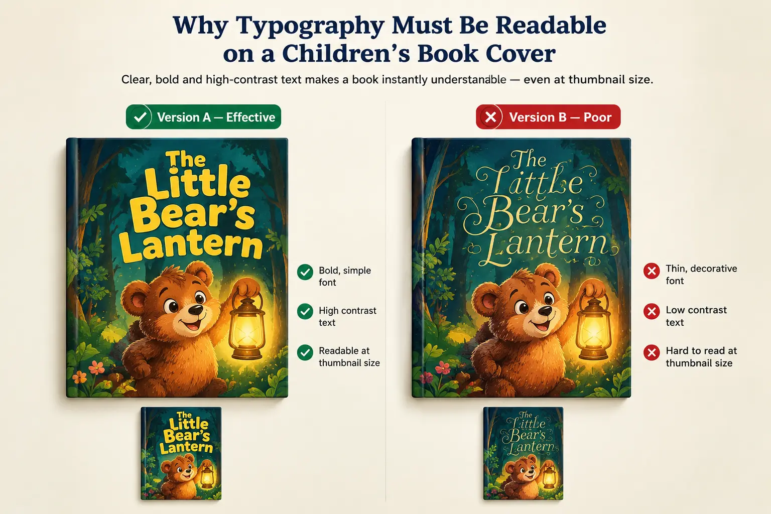
Most parents see a book cover as a tiny thumbnail before they ever hold it in their hands. If the title turns into a blur at that size, the cover has already lost. Rounded, chunky fonts work better for younger age groups, while cleaner sans-serif styles suit school-age and pre-teen books. White or high-contrast lettering against a busy background keeps the title readable without flattening the illustration behind it. Good type does not compete with the artwork. It works with it.
Cover Idea #5
One Focal Point: Give It Room
Cut the Clutter
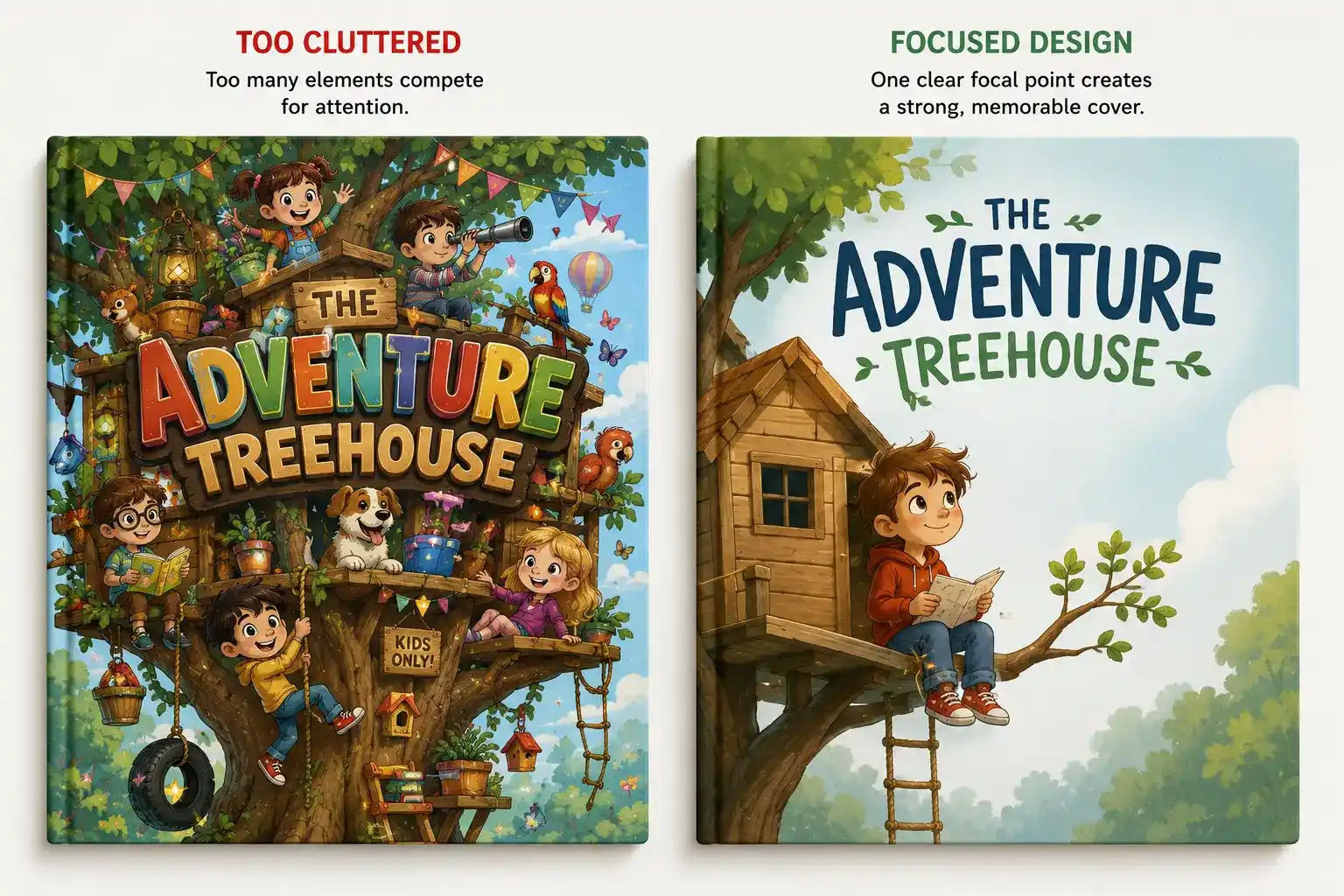
A cover crowded with too many elements ends up saying nothing clearly. The eye does not know where to land, and the whole design feels busy instead of inviting. Good front cover children’s book cover design ideas almost always come back to restraint: one strong image doing the work instead of five smaller ones competing for space.
Center What Matters
Pick one character, object, or scene and give it room to breathe. A single owl on a branch, one child mid-jump, a lone treehouse against the sky- these work because nothing else pulls focus away from them. White space around the subject is not empty. It is what makes the subject stand out.
Cover Idea #6
Science Covers: Show What’s Inside
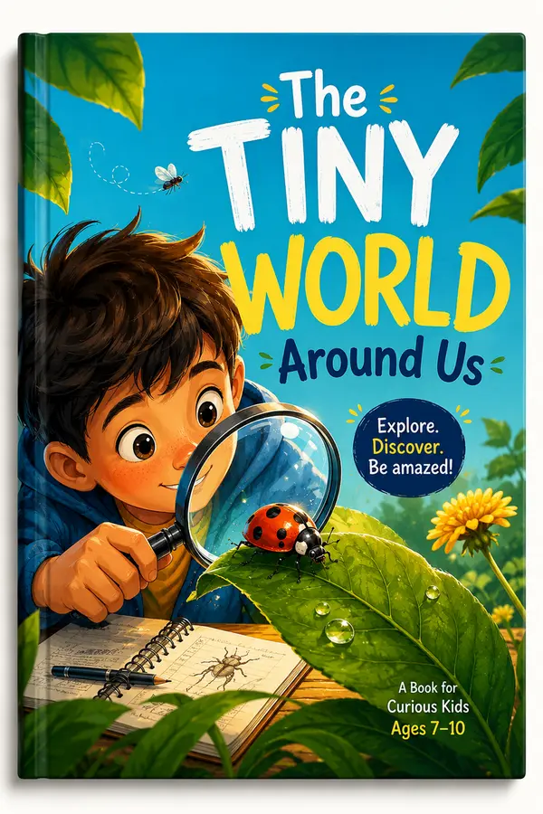
A science or nonfiction cover has a different job than a storybook. It needs to promise learning, not just adventure, and that starts with the right visual cue.
Use a Visual Clue
Nonfiction and science books need a different signal than storybooks. A magnifying glass, a rocket, a planet, or a simple diagram tells the reader instantly that this book teaches something, not just tells a story. Good children’s ideas in science book cover design leans on one clear visual symbol instead of trying to summarize the whole topic in one image.
Keep It Curious, Not Cluttered
The goal is curiosity, not a textbook look. One illustrated bug under a magnifying glass works better than a busy page full of facts and labels. The cover should make a kid want to find out more, not feel like homework before they’ve even opened it.
Cover Idea #7
Series Covers: Stay Consistent
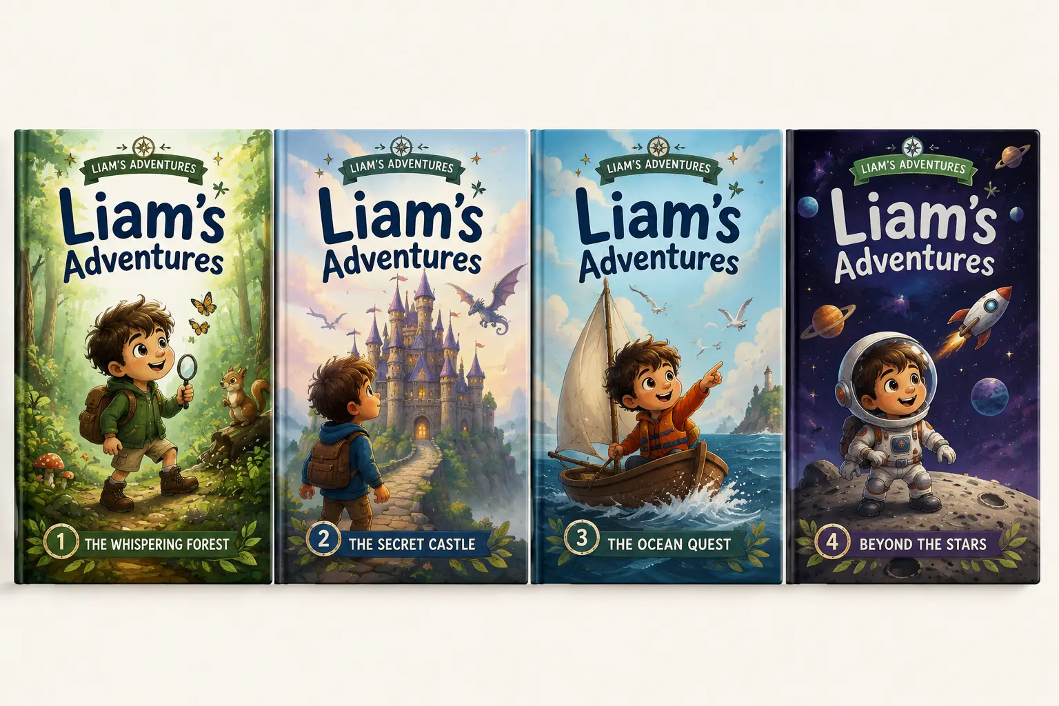
A series lives or dies on recognition. Once a reader likes the first book, the next one needs to look like it belongs to the same family, even from across a bookstore.
Pick One Anchor
Choose a single element to repeat across every cover: the same font, the same color family, or the same character showing up book after book. This one choice does most of the work in tying the series together visually.
Vary the Rest
Backgrounds and scenes can change from book to book. That’s actually expected. What stays fixed is the anchor element. A reader should be able to spot book four in the series from ten feet away, just from the pattern they already recognize.
Cover Idea #8
Texture Over Polish: The Handmade Look
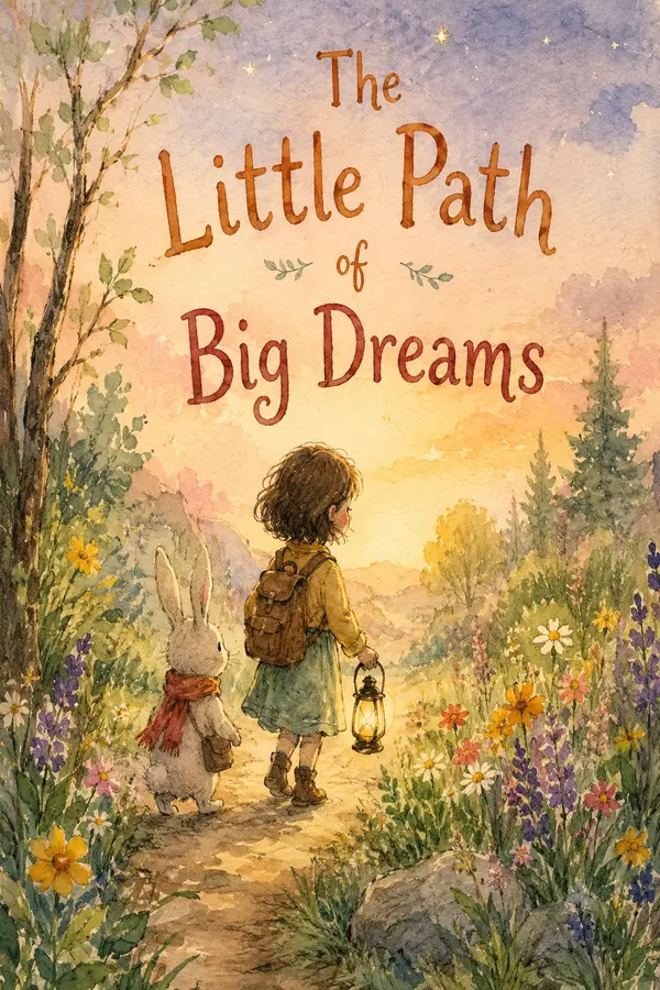
As AI-generated covers become more common, hand-illustrated ones are standing out for the opposite reason: they feel made by a person.
Visible Brushstrokes
Watercolor textures, pencil lines, and slightly imperfect shapes give a cover warmth that polished digital art often lacks. Kids and parents both respond to that handmade quality, even if they can’t name why.
Cover Idea #9
Genre Cues: Match What Kids Expect
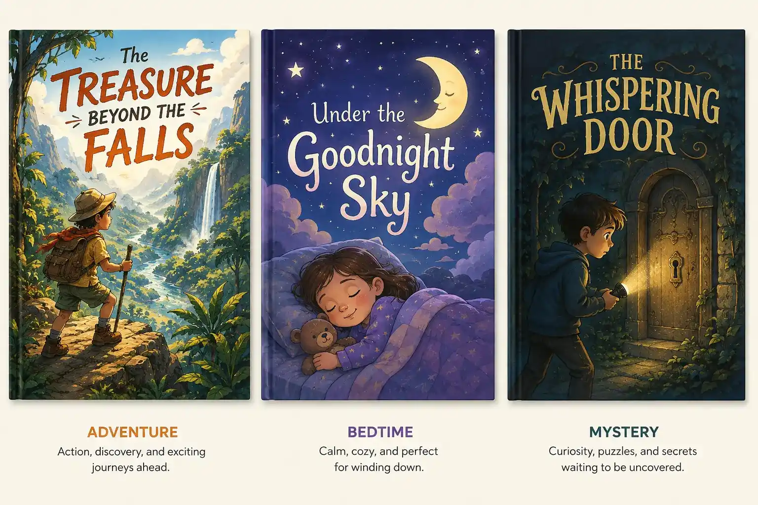
Kids read covers fast, and they’ve already picked up on patterns even if no one taught them the rules directly.
Signal the Category
An adventure book needs movement and outdoor scenery. A bedtime story needs soft colors and quiet scenes. A mystery or spooky tale needs a touch of shadow. When a cover doesn’t match what’s inside, readers notice, even young ones, and it works against the book instead of for it.
Keep the Promise
The cover is a promise about what the story delivers. Breaking that promise, even with a beautiful design, leaves readers feeling misled the moment they start reading.
Cover Idea #10
Test It Small: The Thumbnail Check
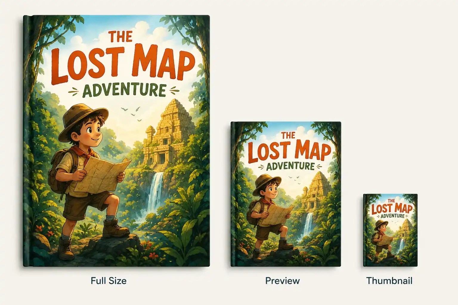
Before calling a cover finished, shrink it down to the size it will actually be seen at, a small online thumbnail or a shelf from a few feet away.
Check What Survives
If the title turns blurry or the character disappears into the background at that size, something needs to change. What looks great as a large file on a screen doesn’t always hold up once it’s small.
One Last Look
This step catches problems before printing or publishing, when fixing them is still easy and cheap.
When to Consider Professional Children’s Book Cover Services
DIY works fine for early drafts or a quick self-published launch on a tight budget. But once a book is going out for real, a cover made in an evening starts to show, and readers notice before they ever read the first page.
What a Designer Actually Does
- A short consultation about the story, the audience, and the tone
- Rough sketches based on that conversation
- Revisions until the cover actually matches the book, not just decorates it
This is the difference professional children’s book cover services bring to the table: a process built around the story instead of a template pulled off a shelf.
When It’s Worth the Cost
If the book is going to bookstores, competing on Amazon, or building a series, that investment pays for itself. A cover that looks amateur costs more in lost sales than the design would have cost upfront.
Finding the Right Children’s Book Publisher
There are two main paths, and the right one depends on how the book is being published.
Going It Alone
Freelance marketplaces connect authors directly with illustrators and cover designers who specialize in children’s books. This route gives full control over budget and style and works well for self-published authors handling the rest of the process themselves.
Going Through a Publisher
Working with kids book publishers, author trust often means cover design is already part of the package, handled in-house by a team familiar with what sells in that market. This path suits authors who want the process managed for them, from concept through final print files.
Either way, the goal stays the same: a cover that fits the book and the audience it’s written for.
FAQs
1) What makes a children’s book cover effective?
An effective cover works for two people at once: the child who has to want it and the parent or teacher who has to buy it. It needs a clear, recognizable character or image, a title that’s easy to read even at a small size, and colors that match the tone of the story inside.
2) How much does a children’s book cover cost?
Costs vary widely based on style and experience. Premade or template-based covers tend to run on the lower end, while fully custom illustrated covers cost more since they’re built from scratch around one specific story and character.
3) Should I hire a designer or design the cover myself?
DIY can work for early drafts or a small self-published launch on a tight budget. Once a book is being published for real, a professionally designed cover tends to perform better since it’s built through sketches, feedback, and revisions rather than a single attempt.
4) Does a children’s book cover need to match the reader’s age exactly?
Yes, closely. A cover built for a toddler looks very different from one built for a pre-teen, in color, character complexity, and typography. A mismatch confuses both the child and the parent deciding whether to buy it.
5) What’s the difference between illustrated and photo-based children’s book covers?
Illustrated covers are the standard for children’s books since they read as playful and age-appropriate. Real photographs are rare in this category and tend to feel too formal or adult for the tone most children’s books are going for.
Final Thoughts
A children’s book cover is doing more work than most people realize. It has seconds to earn attention, and every choice- the character, the color, and the type either helps or hurts that goal. None of this requires reinventing the wheel. It just takes knowing what actually works for the reader in front of you and being honest about when a project needs outside help. Get those two things right, and the cover will do exactly what it’s supposed to: get the book picked up.

As an Editor and Author, I works at childrenpublishers.com, where I contribute to projects that support new and emerging voices in children’s literature while helping authors and illustrators strengthen their professional presence in the publishing world.