 Call Us — +1 (929) 201-3767
 info@childrenpublishers.com

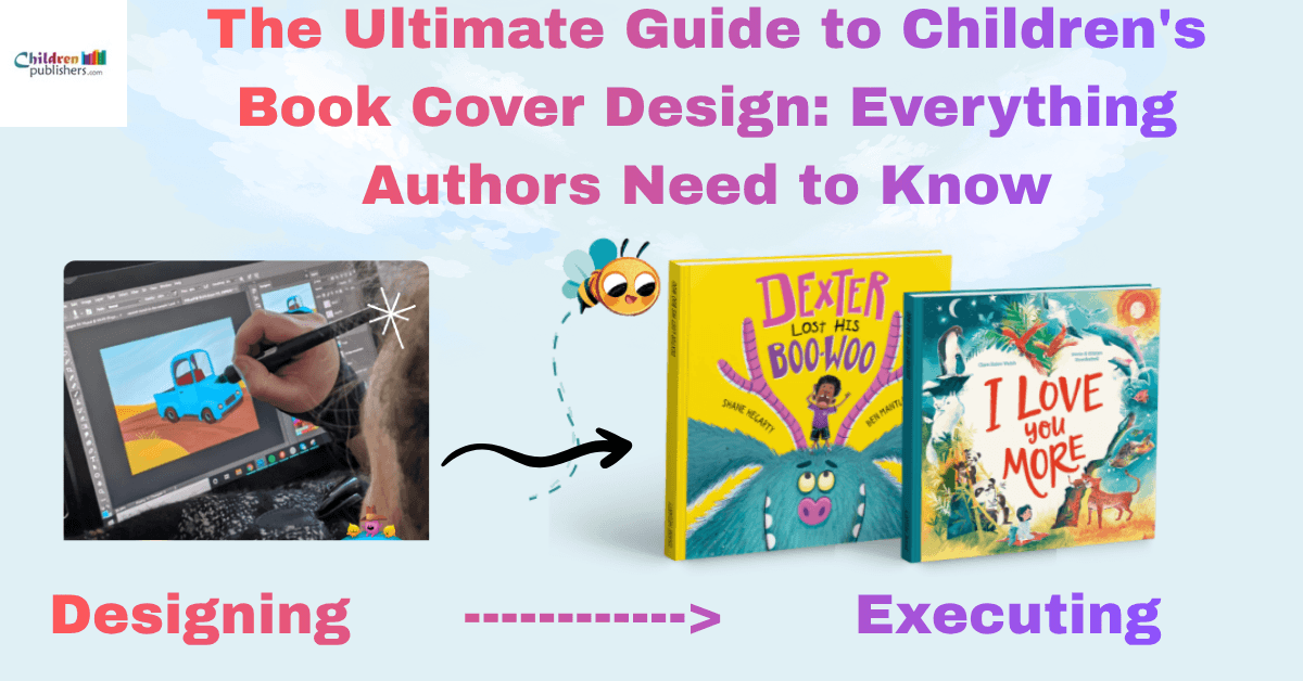
The Ultimate Guide to Children’s Book Cover Design: Everything Authors Need to Know
Most authors spend months getting the story right and about ten minutes deciding what the cover should look like. That order is backwards. On a bookstore shelf or an Amazon thumbnail, nobody reads your first page before deciding whether to stop scrolling. The cover does that job alone, usually in under two seconds, and it either earns a second look or it doesn’t.
This isn’t a list of trends to copy. It’s a practical look at what actually makes a children’s cover work, where to find honest reference points, and where authors and designers tend to go wrong as the deadline approaches.
What Your Cover Is Really Up Against
A children’s book rarely gets picked because someone read the summary first. On Amazon, it’s competing inside a grid of thumbnails, most of them under two inches wide, where a busy parent is scrolling fast and deciding in seconds. In a bookstore, it’s fighting for attention on a shelf packed spine to spine, at a height where a five-year-old is usually the one doing the choosing, not the adult holding the wallet.
That’s the real competition: not other authors’ writing, but everything visually loud enough to catch a glance first. A child will point at whatever grabs them before anyone reads a single line of text, and a parent will often follow that pointing finger rather than override it. This is why children’s book covers get judged so quickly and so instinctively. There’s no time for the artwork to explain itself.
Knowing this changes how you plan a cover. It’s not about fitting everything the story is about into one place. It’s about giving one clear, immediate signal that makes someone stop scrolling or slow down while walking past a shelf.
Where To Actually Look For Inspiration
Skip the general “cover inspiration” boards. They mix romance, thrillers, and picture books together, which tells you nothing about what works in your genre. Go to the actual children’s shelf instead of a physical bookstore if you can, or to a genre-specific section online, and look only at books published in the last year or two in your exact age category.
What to watch for:
which covers repeat the same color logic, the same type-to-image ratio, and the same level of detail. Patterns that show up across five or six recent bestsellers aren’t a coincidence. They’re what’s currently working with buyers and librarians.
Award shortlists and design competitions are also worth a look, since they often surface newer children book illustrators experimenting with fresh approaches before agencies catch on. And if you want a quick starting point instead of a blank page, browsing recent children’s book cover ideas sorted by age category is usually faster than trying to invent a direction from scratch.
How Much Color, Type, And Detailing Actually Help
Two approaches are winning right now, sitting at opposite ends.
Limited, deliberate color:
Instead of a full rainbow, many strong covers stick to two or three colors used consistently, like a uniform for the book. It reads as intentional, not busy, and holds up well at small sizes.
Titles that take up real space:
Hand-lettered or custom type now often covers close to half the front, sometimes woven into the illustration itself. Small, elegant type looks refined at full size but disappears on a phone screen. Bigger type survives the shrink.
Detail is a choice, not a default
- Rich, textured covers work well for slightly older readers who enjoy a visual story
- Stripped-down covers with one character on a plain background can hit just as hard, sometimes harder, since nothing competes for attention
Neither approach is more correct. The right one depends on who will actually be looking at it.
Matching The Cover To The Reader, Not The Shelf
A cover that works for a toddler will usually fail with a ten-year-old, and vice versa. The two age groups aren’t looking for the same thing.
Board books and early picture books
- Flat, bright, simple shapes
- One or two clear elements, nothing that reads as clutter
- Anything too detailed just becomes visual noise
Middle-grade covers
- Can carry more atmosphere and mood
- Closer to a movie poster than a flashcard
- This split holds fairly consistently across American book publishers, even when individual styles differ
Getting this match wrong is one of the more common mistakes: a cover that looks polished on its own but reads as the wrong age once it’s next to the books it’s actually competing with.
Designer vs. DIY
Template tools are fine for a first draft, but they rarely survive contact with print.
| What’s at stake | Template tool | Custom designer |
| Spine & bleed accuracy | Often miscalculated | Handled correctly |
| Genre signaling | Generic may clash with book type | Tailored to your book’s tone |
| Typical cost | Free–$50 | ~$350–500+ |
| Revisions | Manual, DIY | Guided, usually 2–3 rounds |
What you’re actually paying:
Custom children’s book cover work typically starts around $350–500 for a single illustrated cover, front and spine included, and climbs from there depending on the illustrator’s experience and the amount of original art required for the concept. That’s not just for the artwork. It’s for someone who’s designed enough covers to know why a color choice reads as “spooky” instead of “cozy,” or why a title needs to sit half an inch lower than you’d guess.
Most working relationships also move fast: a designer can usually turn a rough concept into real children’s book cover design ideas within a couple of revisions, rather than months of back-and-forth.
Mistakes That Quietly Cost Sales
Trying to summarize the whole plot:
Some covers try to show the main character, the setting, the sidekick, and a hint of the twist, all at once. It ends up looking crowded and forgettable. A cover only needs to make one promise, not tell the entire story.
Covers that look AI-generated:
This is becoming a real problem. AI can produce a cover fast, but it tends to include everything: every character, every plot beat, every mood at once. It doesn’t know what to leave out. Readers notice, even if they can’t say exactly why a cover feels off.
Mismatched genre tone:
A playful font on a spooky story, or a serious layout on a silly one, sends the wrong signal before anyone opens the book.
Getting non-fiction wrong:
For science and STEM titles, the balance is different, even a batch of children’s book covers in science book cover concepts has to look accurate and still feel warm enough for a kid to want to pick it up.
FAQs
What makes a children’s book cover actually work for young readers?
It needs to convey instantly one clear character or idea, strong contrast, and nothing that requires explanation. Kids react to what they can recognize in a second, not what’s technically well-drawn.
How do you design a front cover for a children’s book that works both online and in print?
Test it small first. A front cover children’s book cover design idea that looks great at full size can disappear completely as an Amazon thumbnail, so bold shapes and readable type matter more than fine detail.
Where can I find solid children’s book cover ideas if I’m starting from scratch?
Look at recently published books in your exact age group, not general design inspiration boards. Genre-specific research gives you a far more accurate starting point than broad trend lists.
The One Promise Your Cover Makes
A good cover doesn’t try to tell the whole story. It makes one honest promise: this is a book about wonder, or courage, or silliness, or quiet comfort and lets the reader decide if that’s what they want right now. Before you finalize anything, shrink it down to thumbnail size and look at it from across the room. If it still reads clearly and still feels like the book it’s attached to, it’s doing its job. If it needs explaining, it isn’t ready yet.

As an Editor and Author, I works at childrenpublishers.com, where I contribute to projects that support new and emerging voices in children’s literature while helping authors and illustrators strengthen their professional presence in the publishing world.